WorkIncluded · AI people analytics
Included: design system for an AI product
Included started as a DEI analytics startup and grew into a people management platform with natural language tools and data visualizations. As Staff Product Designer and Lead Designer, I built the design system from the ground up, matured the design practice, and set up how the founders, product, clients and an offshore team worked together.
- Role
- Staff Product Designer, Lead Designer
- Team
- Founders, product, offshore design and engineering
- Result
- A design practice built from the ground up
- Recognition
- 2023 SXSW Innovation Award; acquired by Phenom
The system
Every feature file had the same six pages
The page names did the coordinating. Exploration stayed cheap and open on the first five. The offshore team built only from the last one.
- 01
Cover
The job, its persona and a picture of where it stands.
- 02
Visual research
References and directions, explored closely with the founders.
- 03
User research
What clients told us about the job and how they do it today.
- 04
Discovery
Sketches and options with the founders, the product manager and clients, until the process was written down.
- 05
Flow
How the software could surface it, step by step.
“Developers, this is subject to change, a lot.”
- 06
Build
The approved version, ready for development.
“Developers, this has consensus and user buy-in and won’t change.”
What was slowing Included down?
Every new idea cost engineering time, so exploring was slow.
When I joined, the founder worked directly with the development team, and the CTO built ideas live in the product. Engineering cycles were expensive at the time.
The product was changing shape too. Working with a Fortune 50 automaker’s head of people and Included’s core clients, we grew a DEI analytics tool into a platform that shows talent leaders, recruiters, people managers and heads of people the whole people story of their organization.
What we did
A design system for an AI product, organized by jobs instead of screens
Each job to be done, for each persona or function, got its own numbered Figma file and its own cover color. The file browser read like a map of the product, and everyone knew where a feature lived and how settled it was.
- 2_0_000TA Manager DEI dashboard
- 3_0_000DEI objectives and goals reporting
- 4_0_000Job operations and tactics
- 5_0_000Find applicants
- 6_0_000DEI prospecting assistant
- 7_0_000Slack conversations
- 8_0_000Org Health Scorecard
- 10_0_000Storyboard
- 13_0_000Jobs done navigation
Nine of the feature files, by number.
The flagship
An Org Health Scorecard for heads of people at the biggest clients
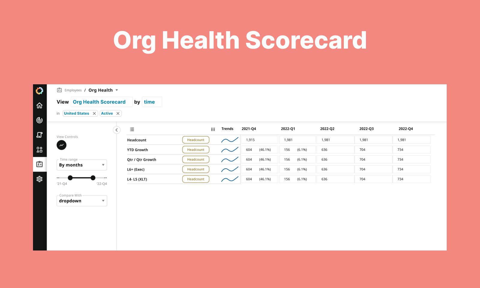
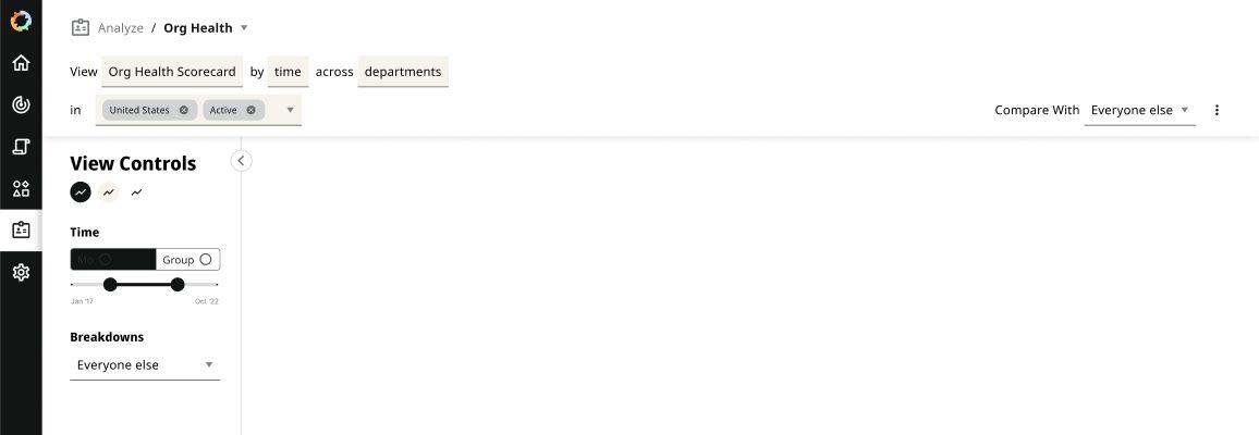
One of the most significant bodies of work was analytics for the heads of people at Included’s largest clients. The interface reads like a sentence: “View Org Health Scorecard by time in United States, Active.” Each word in a box is a control, so you change the question by editing the sentence.
Discovery
Explore wide while it’s cheap
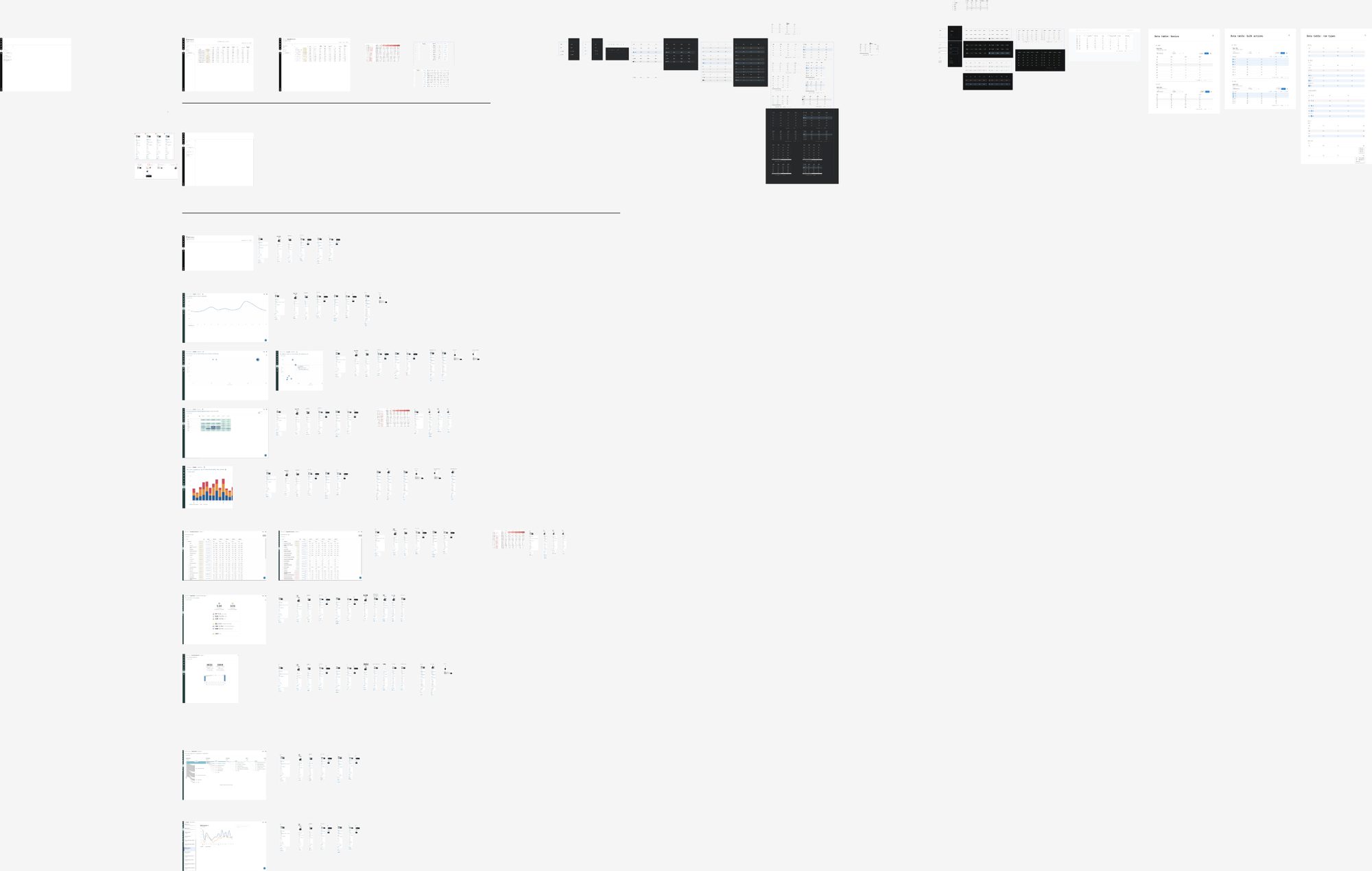
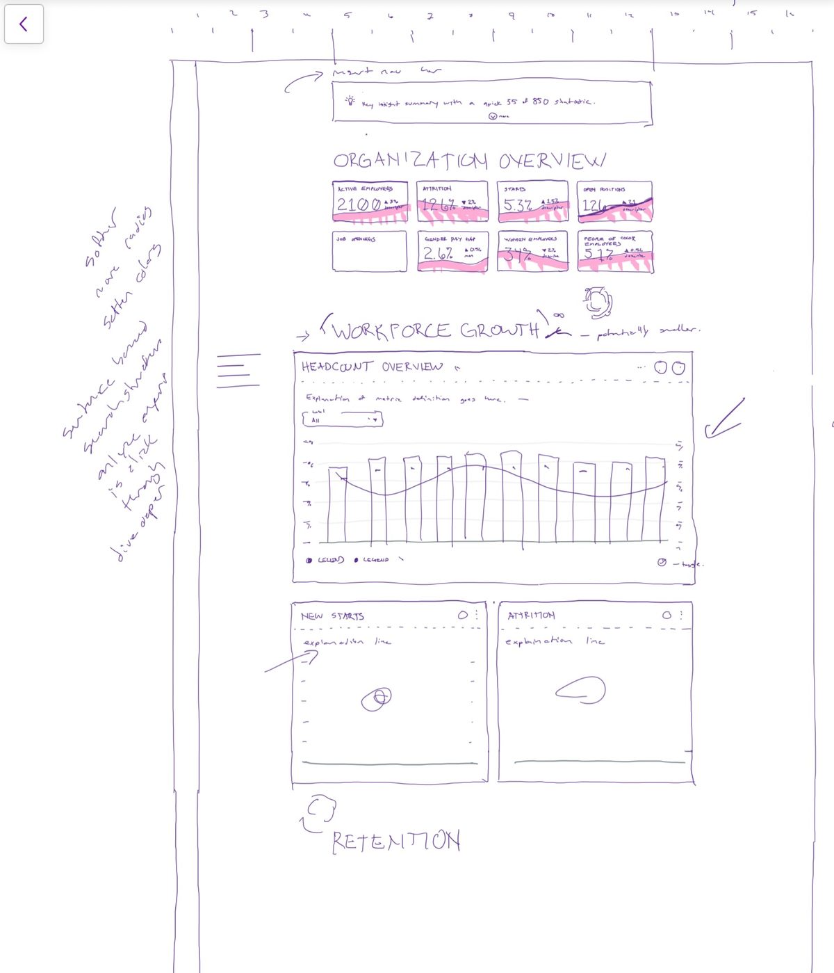
Discovery was where we argued with pictures: line, scatter and heatmap views, stacked bars, KPI cards, dark data tables and table specs, side by side, before a developer touched any of it.
Flow, then Build
Recommended, not recommended, then settled
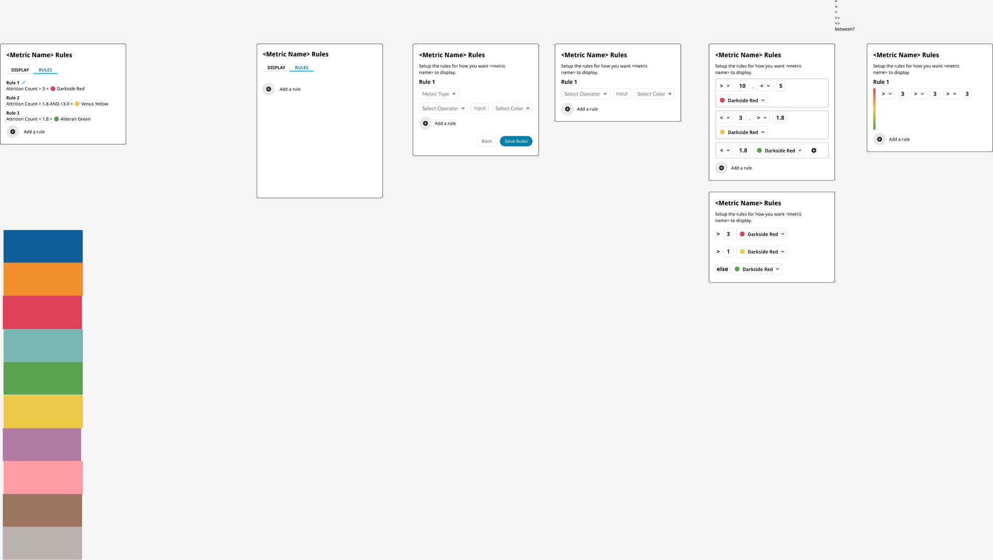
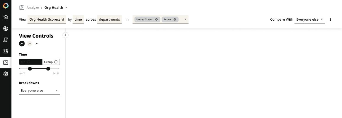
Flow pages put options next to each other with a recommendation, so the team could decide by looking. Here, keeping the sentence and its filters on one line won over splitting them across two.

Where it went
From tables to “Show me a story”
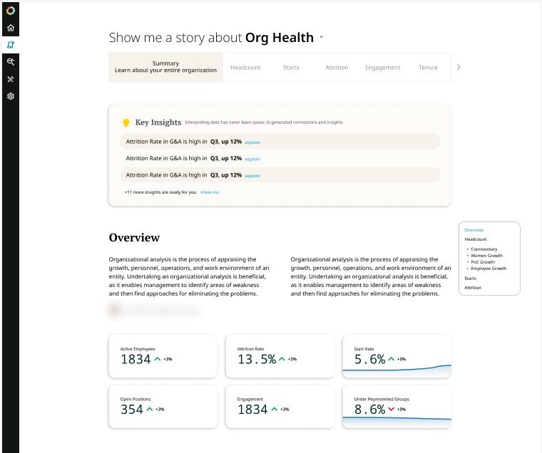
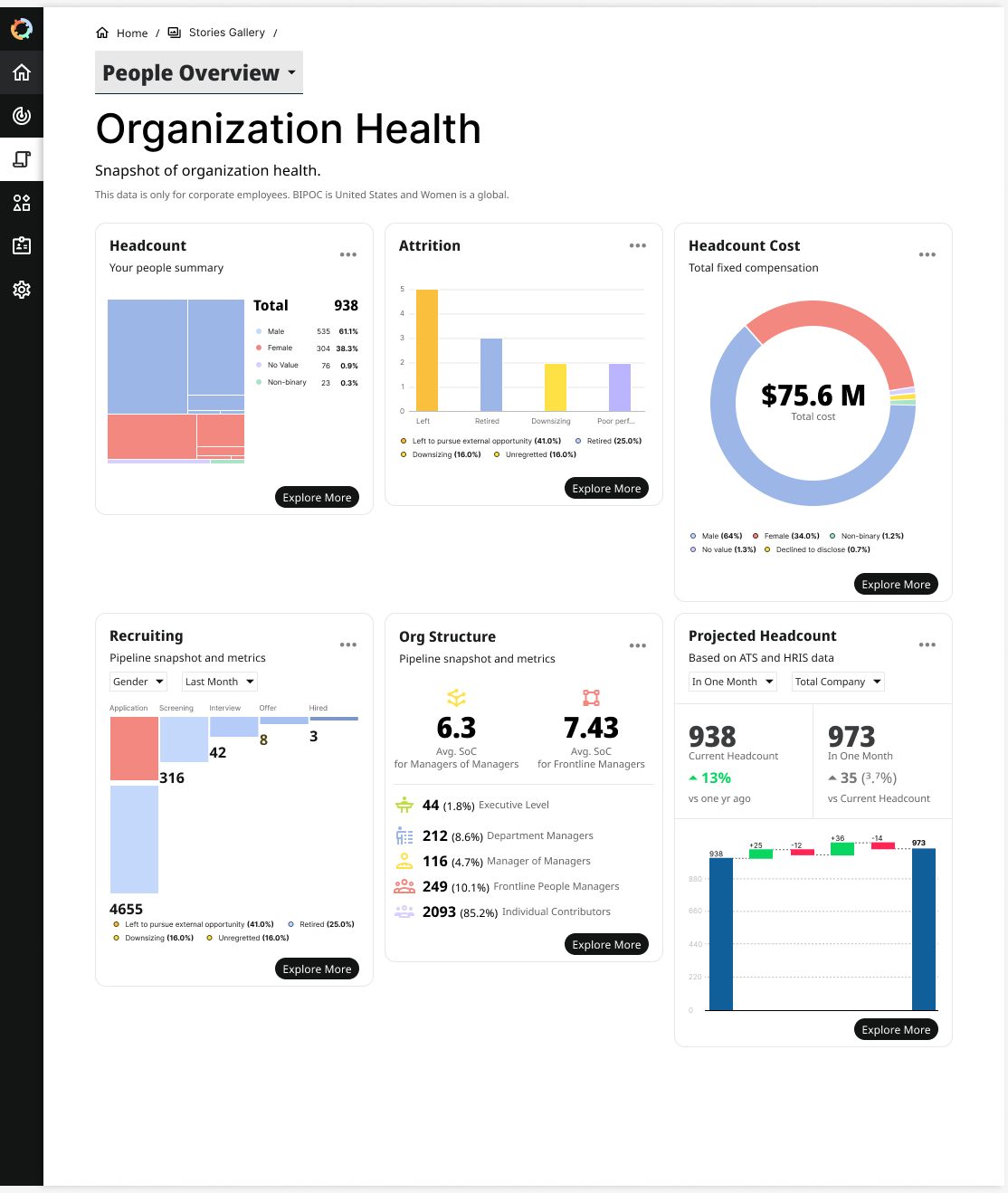
By the end of my year there, we had built out a component library, and I designed a story view for a more natural language interface. Instead of configuring a table, a people leader asks: “Show me a story about Org Health.” The page answers with key insights in plain words, a short overview and the few numbers that matter.
What changed
A design practice, built from the ground up
A design system from the ground up
Built from nothing into the shared parts the whole product was designed and built from.
A design team that leveled up
The offshore designers grew far beyond where they started, and the organization got organized around how design work moves.
Fewer rebuilds
Engineering only touched work that had consensus.
Clearer handoffs
What the offshore engineers needed to build became a lot less fuzzy.
Faster validation
We proved each job to be done with clients in Figma, before any code.
Better interfaces
Usability and visual design improved, and developers began exploring new interaction patterns themselves.
I did this work alongside Chandan Golla, Founder and Head of Product, and Raghu Gollamudi, co-founder and CEO. Conversations with Erik Otteson shaped how I thought about the move from DEI analytics to people analytics. Included won a 2023 SXSW Innovation Award and was later acquired by Phenom.
What this means for your business
Write down what’s settled and what’s still moving, so people can work fast without waiting on you.
At Included it was Flow and Build pages. In a ten-person company it might be a price list, an intake form or a first AI skill. At Gunter Metals, the shop’s prices and stock live in one spreadsheet the owners already edit.
That habit is where the free AI Foundation Kit starts.
Next step